Posts

Week #9

Image
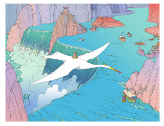
Moebius      This week, I read Blueberry by Moebius. The first reason I chose his work was that I saw the title, “Miyazaki/Moebius: A Joint Exhibition Catalogue” in the course resource page. I did not know Hayao Miyazaki collaborated with Moebius. I wanted to know how Miyazaki was influenced by Moebius’ work.       When I started reading Blueberry (The trail of the Sioux), it reminded me of the conversation I had with the members of ITEC, which is an theme park design company came to the campus last week. They had experiences of working on European theme parks; and they said, “it is surprising how popular the Old West theme is in Europe. They love cowboys and such!” Therefore, it is understandable that Blueberry is one of the most famous works by Jean Gir (Moebius). However, reading through Blueberry, I realized that the story is not similar to those generic Western themed stories; Blueberry is not a stereotypical cowboy/gunman who suddenly appe...

Week #8

March by John Lewis, Andrew Aydin and Nate Powell      By reading this non-fictional comic March , first of all, I was impressed by how much I learned from one comic book. I didn’t know much about the history of racial segregation (which I really should’ve…only thing I knew were about Martin Luther King Jr. and how those restaurants/restrooms were segregated), thus March was really educational for me. Compared to Maus I read last week, I felt that March was more visually expressive and thus easier to read for me.      While March is about the racial segregation and how the activists fought for their right, the story, especially the episodes of John’s childhood, is pretty personal (such as his episode about how he was attached to the chicken his family owned). And yet, the racism he was experiencing are connected to the well-known ideas of segregation, such as the problems about restrooms, school bus, the quality of school building, and so on. Ther...

Week #7

Maus and Barefoot Gen      I read Maus by Art Spiegelman and watched Barefoot Gen for this week. The contents of this week were really heavy, especially because they are both non-fictional stories of the tragic events. However, it was definitely a valuable experience for me to read/watch them. It was interesting that how these two works use different approaches to convey the cruelness of war/holocaust to the audience.       Maus is drawn in pretty minimalist style and uses the representation -Jews as mice, Germans as cats, and Poles as pigs. Despite of its heavy content, I found it fairly easy to read because of this style and representation. Also, I was surprised how the tone (narrative) is quiet and monotonous in Maus; even the expression of the characters are not very explicit. One of the reason behind this settled storytelling might be  that Maus is created from the perspective of Vladek’s son, not Vladek himself; therefore, the tone of...

Week #6

Underground Comic -Mr. Natural / Tits & Clits Comix- Although I was warned that “many of these comics are sexually explicit”, those comics were way more explicit than my expectation; in fact, I expected the contents including sexual innuendo, not the actual depictions of sexism, racism, and so on.  The first underground comic I tried was Mr. Natural by Robert Crumb. To be honest, I was pretty uncomfortable reading it. I was especially shocked by the story of Mr. Natural with an overgrown baby; not only sexism but pedophilia is explicitly depicted. The interesting thing is that I find those sexism in cartoony style more offensive and disturbing than those in realistic style; I think it is because I have a perception that cartoon is more toward the younger audience and thus the contrast of adult contents and cartoony style is odd for me.  I also read Tits & Clits Comix ; I chose this comic because I was interested in the fact that it is an ant...

Week #5

Blankets by Craig Thompson      Reading Blankets by Craig Thompson, I was surprised and fascinated by how deep and profound story the graphic novel can tell. Even though it is a graphic novel which has much less words than the novels, I felt that Blankets ’ visual storytelling covers up those explanation with words.      My favorite part of Blankets is how Craig’s young adult experience is paralleled with his childhood experience. It is an autobiography, but Craig Thompson utilizes a lot of exaggeration and representation in his art; I think that those exaggerations make the story even more realistic because they deliver the strong emotion to the readers. Especially when Craig was small, for instance, that the cubby room’s bed is depicted as a monster with full of spiders. Another example is that the lady at the church (page 61) is portrayed fearfully; it is an exaggeration, but the exaggeration tells us that the teaching from lady which seems like...

Week #4 -Animation

Fleischer Studio      From several Fleischer Studio’s cartoons I watched, Minnie the Moocher was one of the most memorable cartoons for me. I was interested in its bizarre style, rhythm, and combination with jazz music. Also, the fact that Minnie the Moocher does not have a continuous storyline reminds me of the comic strips from this time period.      Minnie the Moocher , which takes its name from Cab Calloway’s song, is a combination of animation and music. Although there is a plot—Betty Boop runs away from her house with Bimbo and meets the ghosts singing Minnie the Moocher — , the storyline is not solid. Instead, this cartoon shows Fleischer Studio’s technique and new invention: rotoscoping. In order to animate Calloway’s dance, the dance is filmed and projected onto the back of a glass easel so that the motion can be traced on the paper. The interesting point is that it can be seen that only Calloway (the ghost dancing like Calloway) is rotoscop...

Week #4

Shadow and Texture in Hergé and Carl Barks' comic For this week, I read Explorers on the Moon by Hergé and The Hard Loser by Carl Barks. Needless to say, the stories in these comics are much complicated and have continuous storylines from the beginning to the end compared to the comic strips from last week. However, another factor interested me was their use of shadow and texture.  The comics by Hergé and Carl Barks have a very similar style in terms of shadow and texture. Although shadow and texture can be seen in the background, such as major cast shadows on the ground, both Hergé and Carl Barks rarely use shadow and texture on the characters; the characters are drawn with clear, minimum amount of lines, and painted with one solid color for each section (e.g. wrinkles on the shirt is not darkened). I relate this characteristic to the explanation in Understanding Comics by Scott McCloud. Without shadow and texture, the characters in Hergé and Carl Barks’ comics stay a...