Posts

Another recommendation -The Dam Keeper-

Image
The Dam Keeper #1 by Robert Kondo and Dice Tsutsumi For the last post, I wanted to mention about this graphic novel called the Dam Keeper. (I hope the library gets volume #2 and #3 soon!) The Dam Keeper is created by my favorite artists, Robert Kondo and Dice Tsutsumi. It is a full-color graphic novel about a lonely pig who protects the village from the pollution by using the dam he lives in. It is created as a sequel of the Dam Keeper, a short animation they created.  One of my favorite things about this graphic novel is its use of color and lighting. In fact, Kondo and Tsutsumi are former artists at Pixar who worked on the concept art; also, Tsutsumi worked on the color script of Monster’s University. In the Dam Keeper, their skill of coloring and lighting developed in the animation industry is fully used to tell the story. Especially in pig’s flashback, warm and cool color contrast is even more exaggerated, reflecting that the memories are more dramatized and thus its ...

Week #14

Image
Webcomics - Ojisama to Neko - Link to Ojisama to Neko: https://mangarock.com/manga/mrs-serie-100190092 This week I read couple webcomics including this flash comic recommended on the course website ( https://www.deviantart.com/balak01/art/about-DIGITAL-COMICS-111966969 ), My Lesbian Experience with Loneliness by Nagata Kabi, and Ojisama to Neko by Umi Sakurai. My Lesbian Experience with Loneliness and Ojisama to Neko both started as webcomic (on Pixiv/Twitter) posted irregularly and not really meant to be published; however, these became so popular online and eventually they are published as comic books. Maybe due to their origin, they are“slice of life” type of story which doesn’t have a big climax or conflict, but I really liked both of them; their stories are very specific and personal, and have mixture of comedy and emotional elements. My Lesbian Experience with Loneliness has deep personal experience and thought, (which I didn’t expect from its title!) and above all,...

Week #13

Black Panther (2016) by Coates, Stelfreeze, and Martin This week I read Black Panther (2016). Last year I watched the movie multiple times as I loved it so much, so it was interesting to read its comic.  First of all, I loved its beautiful art although I kind of miss the old-fashion texture of classic superhero comics at the same time. My favorite part of its art is the use of color; since several different tribes are depicted in Black Panther, the color really enhances their difference and uniqueness. The first page (before “You have lost your soul”) is such a great illustration and excited me to read this comic from the beginning; In this page, three colors -blue, green, and red- show each groups and in the foreground, T’challa’s black costume contrasts with those colors. Though the comic is new, I like that the use of contrast between shadow and light (a big area of shadow, sometimes whole figure is in silhouette) still look classic. The way they use geometric patterns ...

Assessment -Batman The Killing Joke-

Batman The Killing Joke What is the reaction to the text you just read? I actually don’t know the other story of Batman (I should…), so it is hard to compare this comic to other classic Batman. The comic is very well illustrated with its detailed and clear art style; however, those great illustration are also frightening for me at times when the artist depicts Joker in close-up. Also, the setting and characters of Joker’s theme park looks disturbing; but I think they are supposed to be disturbing as Joker uses this theme park to make people lose their sane, thus the artist successfully portrays this setting. I like the last page (pg50) showing Batman and Joker’s interaction in nine panels. It is sort of ambiguous what happened to Joker at the end, but for me, this vague ending seems appropriate for this comic. By reading only this comic, I felt like the change in Joker (how he loses his sane in the past) is very abrupt. I understand that he lost his wife and baby, but he did n...

Week #12

This One Summer by Jillian and Mariko Tamaki      As I started reading This One Summer , I finished reading it in one sitting. It was very interesting and aesthetically appealing. At first, especially when I saw the montage pages (page 44-53), I expected that this comic is a “diary” kind of story which doesn’t have a big climax… I was wrong! Though this comic captures even tiny moments of the characters’ life, it also tells a family drama in where each characters’ emotions are carefully depicted.      First of all, I wonder how Mariko Tamaki is able to capture those moments that a lot of us experience in our childhood; looking down on cartoons and trying horror movies, digging a nonsense hole at the beach, having a crush on someone older than you (and that person is not as cool as you thought when you look back…just like the Dud in this comic!)…I recalled similar memories from my childhood because of this comic, but those childhood memories are har...

Week #11

Asterios Polyp by David Mazzucchelli      This week I mainly read Asterios Polyp by David Mazzucchelli. I was immediately fascinated by its color aesthetic and use of shapes, but moreover, what makes this this work interesting is its philosophical contents. The story and ideas in Asterios Polyp is complicated and I felt that I sometimes wasn’t able to grasp the ideas enough; however, that is probably a great thing about this comic. It requires me to reread in order to understand, and I will find more and more things I didn’t catch in the first reading. Also, the interpretation of this work will vary depending on each readers’ experience, age, and situation, since the ideas suggested in Asterios Polyp such as duality, identity, self, etc. can be significantly different for one person from another.      My favorite part of this comic is the depiction of relationship between Asterios and Hana. While Hana is a great character (not just “an ordinary ...

Week #10

Image
Buddha and Ranma Vol#1      This week, I read Osamu Tezuka’s Buddha (Vol.1) and Ranma (Vol.1) by Rumiko Takahashi. To be honest, I have never read the work of Osamu Tezuka (especially as a Japanese, I really should’ve, but the manga I read in my childhood were mostly Doraemon by Fujiko Fujio, Mitsuru Adachi’s works, and other recent ones such as One Piece ). I’m glad that I got a chance to read them this week as he gave a huge influence to a lot of Japanese artists (and even worldwide). Moreover, I found some interesting differences between American comic books and Japanese manga; and thus I felt that I was able to know a little bit more about my own culture from reading manga.      The difference I felt the most between American comics and manga was their character archetypes. When I was reading American comics in the previous weeks, I feel that many comics/comic strips often have the characters based on archetypes: hero, villain, heroin, clow...

Week #9

Image
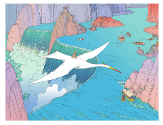
Moebius      This week, I read Blueberry by Moebius. The first reason I chose his work was that I saw the title, “Miyazaki/Moebius: A Joint Exhibition Catalogue” in the course resource page. I did not know Hayao Miyazaki collaborated with Moebius. I wanted to know how Miyazaki was influenced by Moebius’ work.       When I started reading Blueberry (The trail of the Sioux), it reminded me of the conversation I had with the members of ITEC, which is an theme park design company came to the campus last week. They had experiences of working on European theme parks; and they said, “it is surprising how popular the Old West theme is in Europe. They love cowboys and such!” Therefore, it is understandable that Blueberry is one of the most famous works by Jean Gir (Moebius). However, reading through Blueberry, I realized that the story is not similar to those generic Western themed stories; Blueberry is not a stereotypical cowboy/gunman who suddenly appe...

Week #8

March by John Lewis, Andrew Aydin and Nate Powell      By reading this non-fictional comic March , first of all, I was impressed by how much I learned from one comic book. I didn’t know much about the history of racial segregation (which I really should’ve…only thing I knew were about Martin Luther King Jr. and how those restaurants/restrooms were segregated), thus March was really educational for me. Compared to Maus I read last week, I felt that March was more visually expressive and thus easier to read for me.      While March is about the racial segregation and how the activists fought for their right, the story, especially the episodes of John’s childhood, is pretty personal (such as his episode about how he was attached to the chicken his family owned). And yet, the racism he was experiencing are connected to the well-known ideas of segregation, such as the problems about restrooms, school bus, the quality of school building, and so on. Ther...

Week #7

Maus and Barefoot Gen      I read Maus by Art Spiegelman and watched Barefoot Gen for this week. The contents of this week were really heavy, especially because they are both non-fictional stories of the tragic events. However, it was definitely a valuable experience for me to read/watch them. It was interesting that how these two works use different approaches to convey the cruelness of war/holocaust to the audience.       Maus is drawn in pretty minimalist style and uses the representation -Jews as mice, Germans as cats, and Poles as pigs. Despite of its heavy content, I found it fairly easy to read because of this style and representation. Also, I was surprised how the tone (narrative) is quiet and monotonous in Maus; even the expression of the characters are not very explicit. One of the reason behind this settled storytelling might be  that Maus is created from the perspective of Vladek’s son, not Vladek himself; therefore, the tone of...

Week #6

Underground Comic -Mr. Natural / Tits & Clits Comix- Although I was warned that “many of these comics are sexually explicit”, those comics were way more explicit than my expectation; in fact, I expected the contents including sexual innuendo, not the actual depictions of sexism, racism, and so on.  The first underground comic I tried was Mr. Natural by Robert Crumb. To be honest, I was pretty uncomfortable reading it. I was especially shocked by the story of Mr. Natural with an overgrown baby; not only sexism but pedophilia is explicitly depicted. The interesting thing is that I find those sexism in cartoony style more offensive and disturbing than those in realistic style; I think it is because I have a perception that cartoon is more toward the younger audience and thus the contrast of adult contents and cartoony style is odd for me.  I also read Tits & Clits Comix ; I chose this comic because I was interested in the fact that it is an ant...

Week #5

Blankets by Craig Thompson      Reading Blankets by Craig Thompson, I was surprised and fascinated by how deep and profound story the graphic novel can tell. Even though it is a graphic novel which has much less words than the novels, I felt that Blankets ’ visual storytelling covers up those explanation with words.      My favorite part of Blankets is how Craig’s young adult experience is paralleled with his childhood experience. It is an autobiography, but Craig Thompson utilizes a lot of exaggeration and representation in his art; I think that those exaggerations make the story even more realistic because they deliver the strong emotion to the readers. Especially when Craig was small, for instance, that the cubby room’s bed is depicted as a monster with full of spiders. Another example is that the lady at the church (page 61) is portrayed fearfully; it is an exaggeration, but the exaggeration tells us that the teaching from lady which seems like...

Week #4 -Animation

Fleischer Studio      From several Fleischer Studio’s cartoons I watched, Minnie the Moocher was one of the most memorable cartoons for me. I was interested in its bizarre style, rhythm, and combination with jazz music. Also, the fact that Minnie the Moocher does not have a continuous storyline reminds me of the comic strips from this time period.      Minnie the Moocher , which takes its name from Cab Calloway’s song, is a combination of animation and music. Although there is a plot—Betty Boop runs away from her house with Bimbo and meets the ghosts singing Minnie the Moocher — , the storyline is not solid. Instead, this cartoon shows Fleischer Studio’s technique and new invention: rotoscoping. In order to animate Calloway’s dance, the dance is filmed and projected onto the back of a glass easel so that the motion can be traced on the paper. The interesting point is that it can be seen that only Calloway (the ghost dancing like Calloway) is rotoscop...

Week #4

Shadow and Texture in Hergé and Carl Barks' comic For this week, I read Explorers on the Moon by Hergé and The Hard Loser by Carl Barks. Needless to say, the stories in these comics are much complicated and have continuous storylines from the beginning to the end compared to the comic strips from last week. However, another factor interested me was their use of shadow and texture.  The comics by Hergé and Carl Barks have a very similar style in terms of shadow and texture. Although shadow and texture can be seen in the background, such as major cast shadows on the ground, both Hergé and Carl Barks rarely use shadow and texture on the characters; the characters are drawn with clear, minimum amount of lines, and painted with one solid color for each section (e.g. wrinkles on the shirt is not darkened). I relate this characteristic to the explanation in Understanding Comics by Scott McCloud. Without shadow and texture, the characters in Hergé and Carl Barks’ comics stay a...

Week #3 -additional reading

Peanuts  For additional readings of this week, I read more Peanuts by Charles Schulz. By reading the Complete Peanuts 1950-52, 1959-60, and 1997-98 , I was able to see how Peanuts developed through its run. In 1950-52, the look of the comic’s characters is very different from now. Charlie Brown does not have his iconic pattern on his T-shirt until page 36, and even the number of the character is much less than later Peanuts . However, the biggest difference might be the design of Snoopy; in the early comic strips, Snoopy looks more generic dog and has less character than now. The impression I get from the early Peanuts is “Charlie Brown and his friends”; the other characters are not very unique and do not have a solid personality. However, by 1959, the design of Peanuts became much closer to the one in recent years. Though background still remains simple, the character design become more complicated. Each characters are easily identifiable because of their unique hai...

Week #3

Little Nemo and Krazy Kat For this week, I read multiple comic strips made in 20th century. I especially would like to compare two comics, Winsor McCay’s Little Nemo and George Herriman’s Krazy Kat . Even though they are both highly regarded comic strips in the same time period, they have very different characteristics. Winsor McCay’s Little Nemo is a full-color comic strips started in 1905. The section I read is Little Nemo in the Palace of Ice . First of all, I was impressed by its beautiful use of color and detail. It is interesting that the whole story in Little Nemo is actually Nemo’s dream. The final panel in which Nemo wakes up is always very simple (white bed, gray wall, etc.); it gives a great contrast between Nemo’s real world and his colorful dream world. Little Nemo uses a lot of action-to-action transition and thus it is easy to read what is happening in the scene. I feel that the gags in Little Nemo tend to be soft, not really emphasized; it is because the ...

Week #2 -film

The Adventures of Prince Achmed by Lotte Reininger - comparison with a wordless comic, the Arrival -      Lotte Reininger’s the Adventure of Prince Achmed is a film with no spoken dialogue. I found that there are similarities between this film and a wordless comic, the Arrival by Shaun Tan.       While the Arrival is completely wordless, there are written plots between the scenes in the Adventures of Prince Achmed . However, those written plots are just minimum, which is necessary to tell the characters’ name, locations, time, and so on. The reason for this difference between two works might be the amount of detail; in the Arrival , the artist is able to show the details of locations and characters by its art and thus it does not require any words. On the other hand, the Adventures of Prince Achmed only uses silhouette to tell the story and thus the amount of details is more restricted. However, similar to the Arrival, the Adventures of Pr...

Week #2

Understanding Comics by Scott McCloud   For me, a beginner of learning the literature of comics, Scott McCloud’s Understanding Comics was full of new and fascinating information. I was especially interested in the section explaining the “Transition Scale” in comics.   According to Understanding Comics, the scale of transitions from panel to panel can be sorted into six categories: 1. moment-to-moment, 2. action-to-action, 3. subject-to-subject, 4. scene-to-scene, 5. aspect-to-aspect, and 6. non-sequitur. In this book, the types of transitions in famous comics are broken down and shown as bar graphs. An interesting fact shown in the graphs is that while types 2-4 are common in Western comics, Japanese comics have high incidences of the fifth type, aspect-to-aspect. Although aspect-to-aspect transition is most often used to establish a mood or a sense of place, Japanese comic artists including Osamu Tezuka use this transition so that the readers assemble a single...

Week #1

The Arrival by Shaun Tan   Shaun Tan’s the Arrival is a wordless graphic novel which depicts a father and his family emigrating to a fantastical foreign land. Although it does not have any dialogue, the Arrival succeeds to tell a story and deliver the characters’ emotion with its beautiful combination of realistic style and fantasy.    Regarding the layout of the Arrival, it is noticeable that the novel has an unique composition using square panels aligned. This layout helps to keep the flow of panels, especially when multiple panels show the continuous motion of the characters. Similar to a storyboarding, many pages of the Arrival depict the movements in detail, such as hands, a character walking and talking, etc. This style is one of the reasons that the Arrival is able to tell a story without any dialogue since the readers can easily understand the movements in the story. Using different angles and points of view, the Arrival illustrates its beautiful wor...